Industry
Academia
Serivces
UX/UI + Content Strategy
Transforming an institution into a community
PROBLEM
Academic excellence hiding its heart
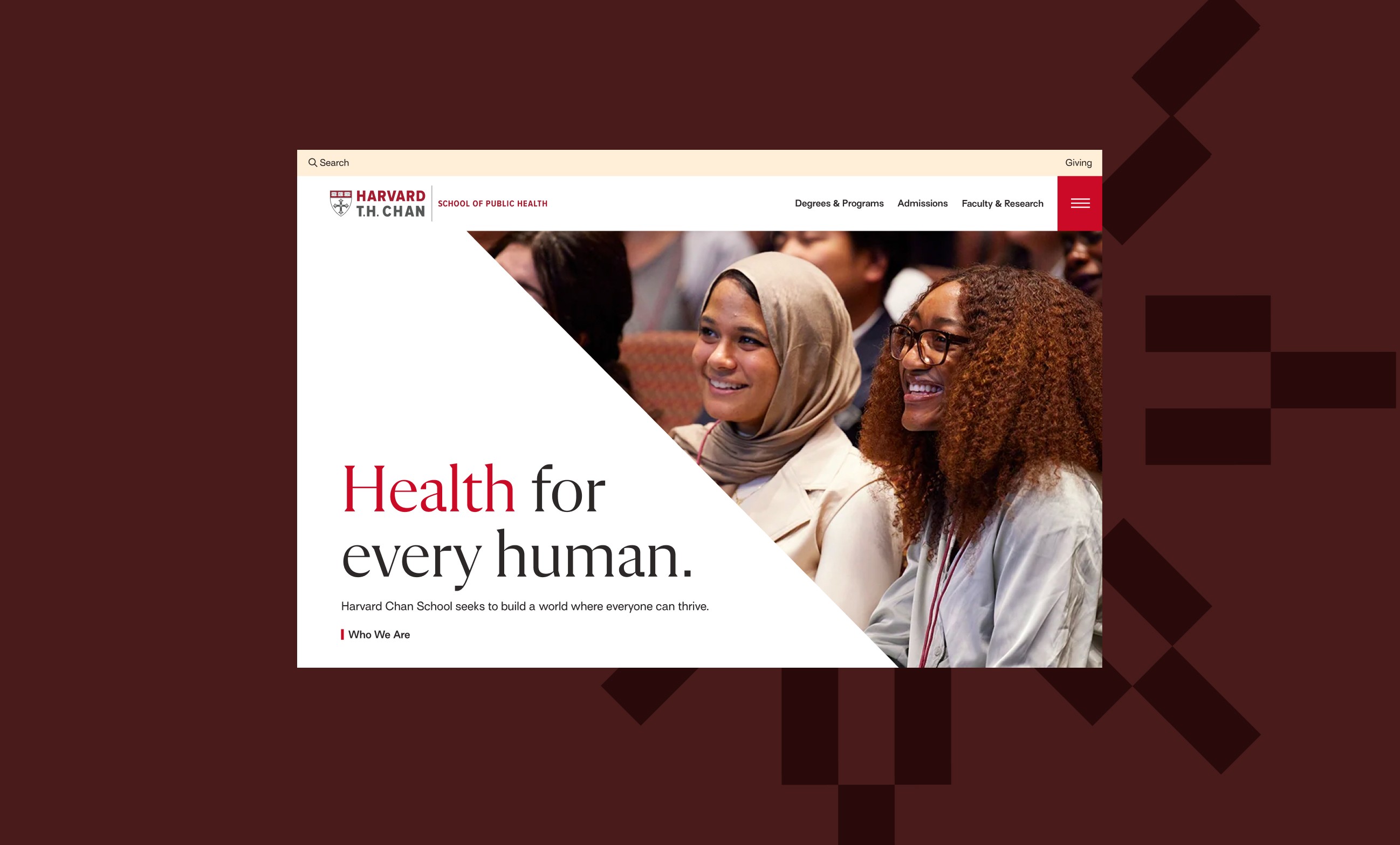
Harvard Chan School solves global health challenges through research and education. But their digital presence told a different story. Despite housing passionate students and researchers working on humanity's biggest health problems, the school's brand felt cold and institutional. What was worse was that their application flow required applicants to use two different systems, which hindered applicants. Their community was hidden and the experience broken.
APPROACH
Community came first, then a streamlined application and user journeys
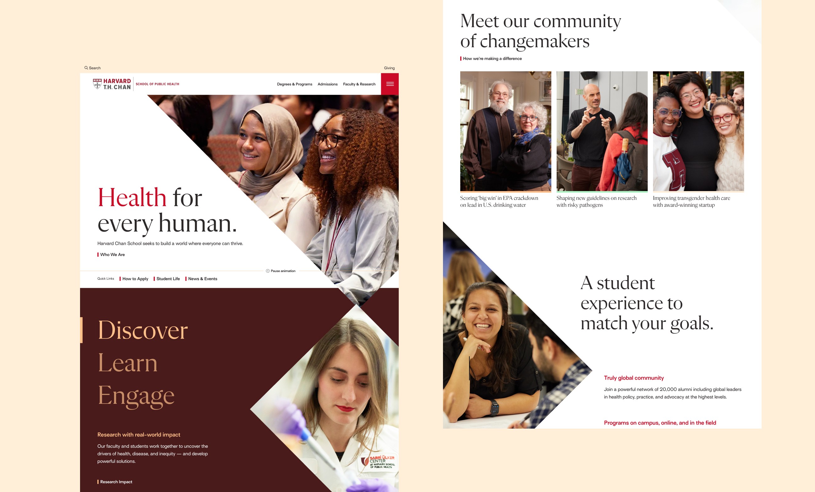
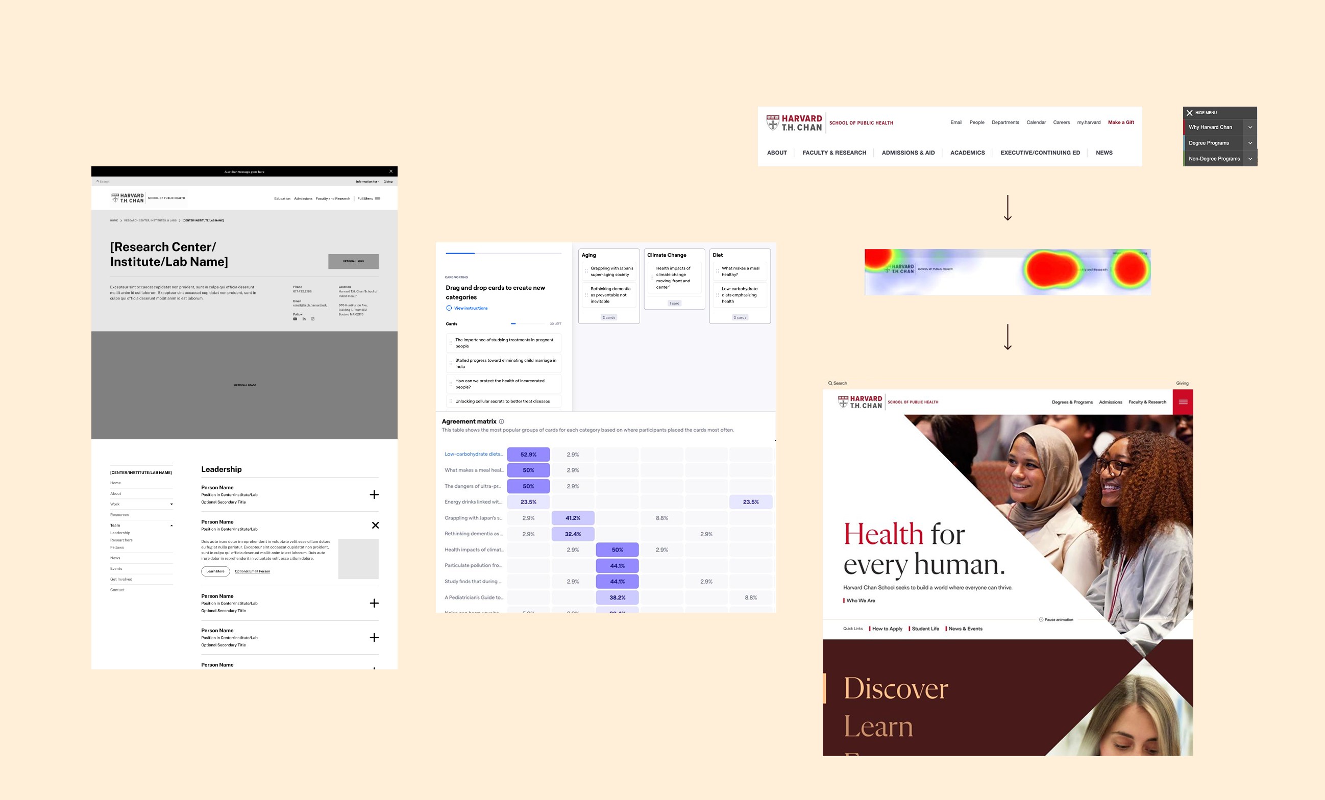
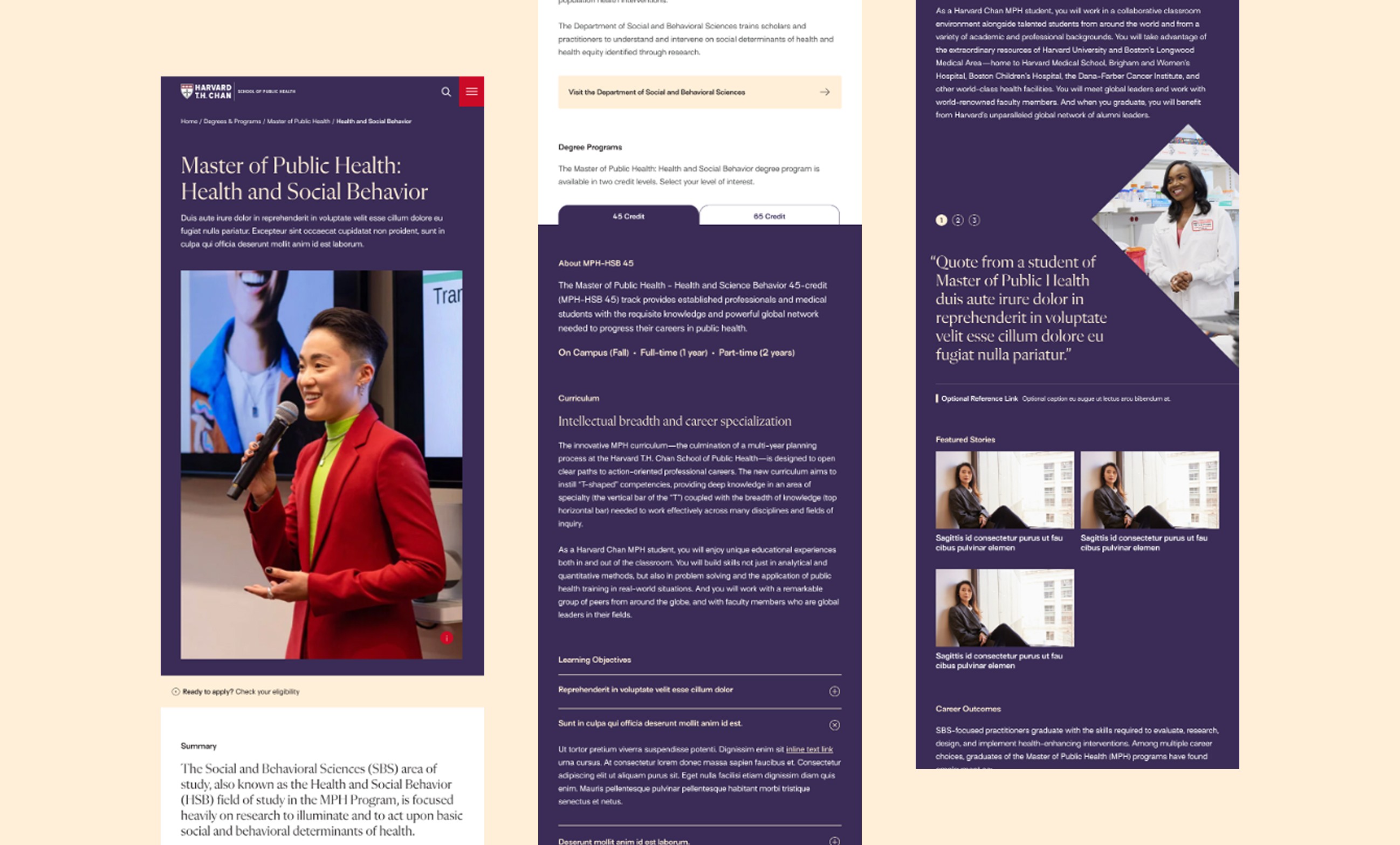
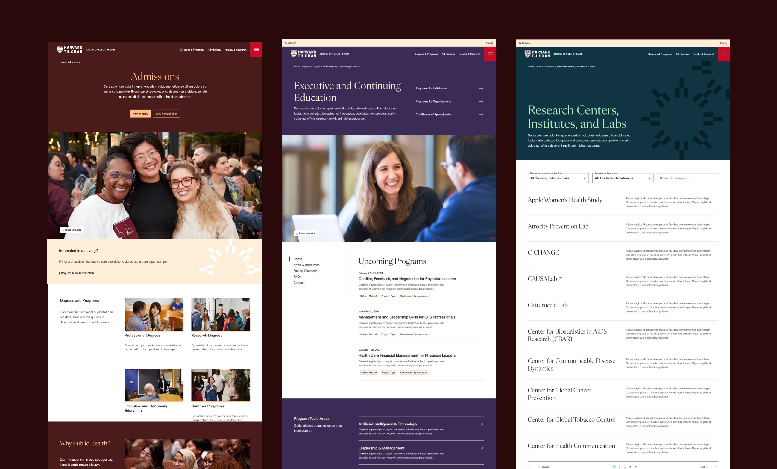
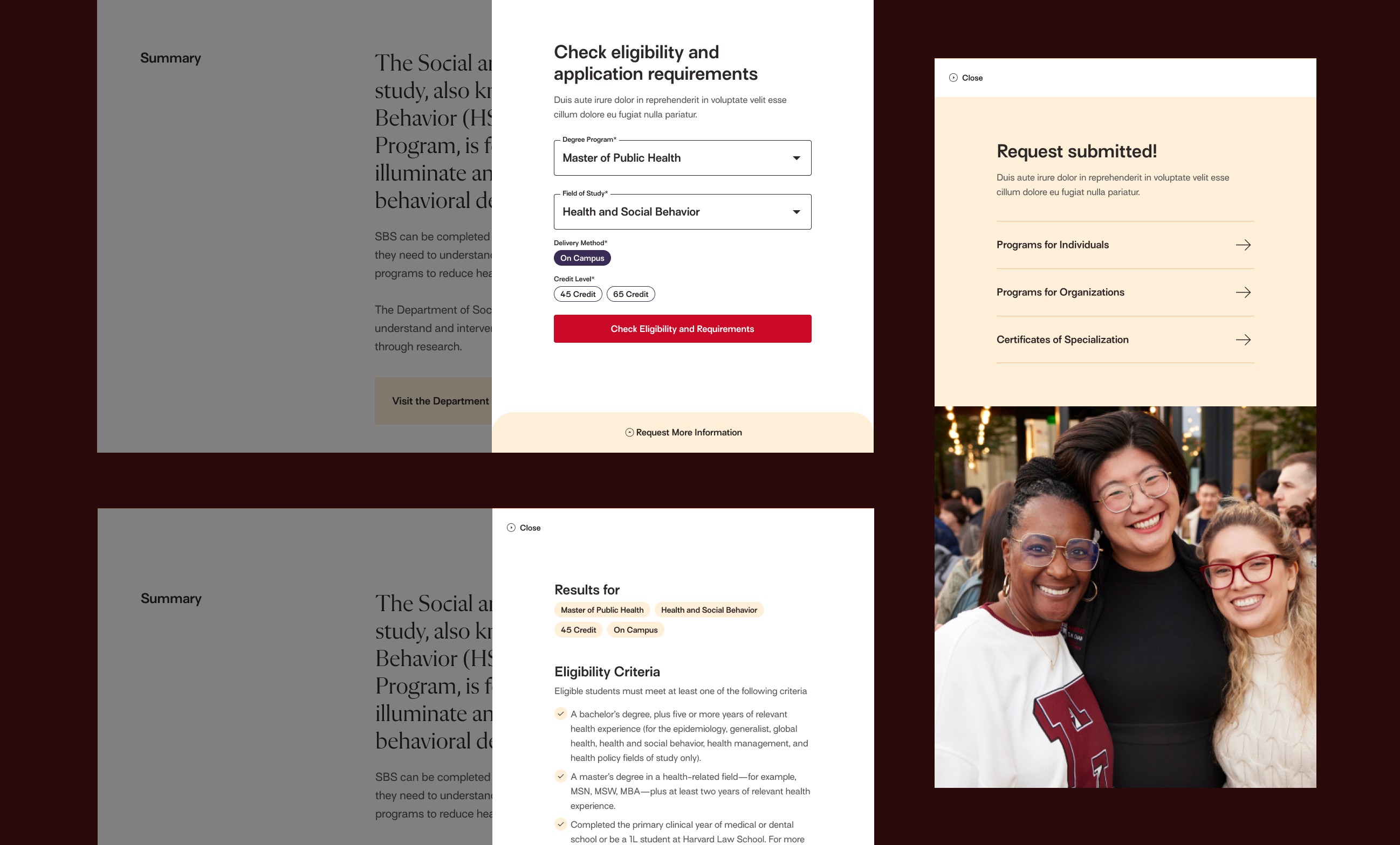
We put the school's community at the center of everything. Our "public health halo" became the visual thread—building blocks that show how knowledge spreads from campus to create global change. Then reality hit: 192 separate subsites lived under one roof, and their application process was a challenge. Each department had built their own digital kingdom over decades. And, unlike MBAs, public health degree seekers customize their degrees to achieve better outcomes, creating additional complexity. We ran workshops where department leaders shared their needs and conducted card sorting and usability tests to create optimized user journeys. We built tools that made content creation easier—AI alt text, live SEO guidance, integrated asset management while designing a first-of-its-kind application tool to encourage better conversions.
OUTCOME
A warmer Harvard that works harder
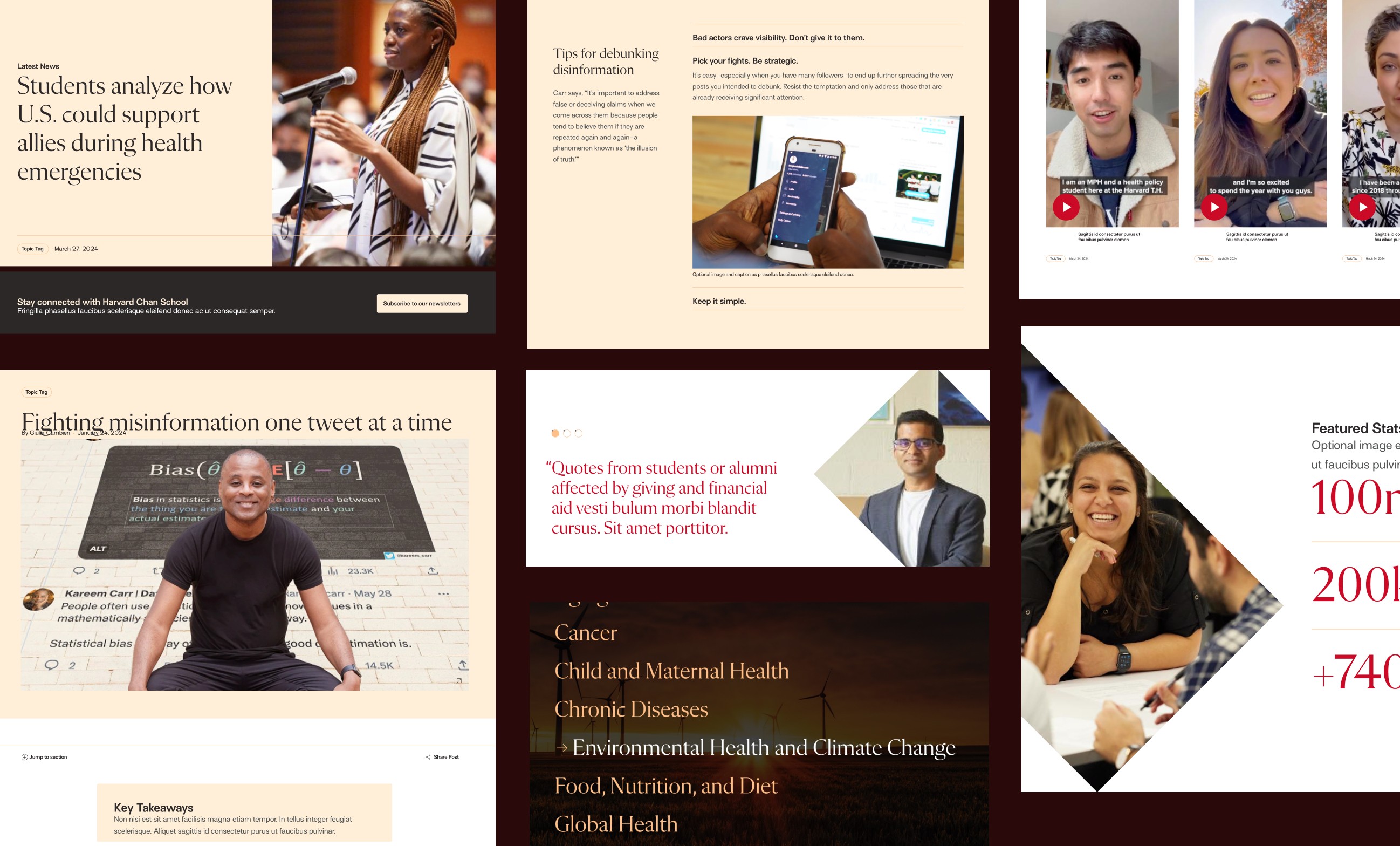
The content focuses on transformation over statistics—how people grow through their work at the school. The application tool and the design system increased application conversion and reduced time for the school staff. We documented and trained the staff with a new content strategy with key performance metrics. The site won a Webby Award. More importantly, it balances Harvard's prestige with genuine approachability. The school now looks like what it actually is: a place where rigorous scholarship meets deep care for humanity.